iDare Branding
Building a brand identity for a mental health platform that needed to feel safe before it said anything
Visual Design

Project Overview
Client: iDare, a Mental Health Brand
Timeline: 4 weeks (2024)
My Role: Visual Designer
01 — Where it started
Mental health is a category where the brand does a lot of the work before a user even opens the app. The moment someone lands on a mental health platform, they're making a quick, instinctive decision — does this feel like a place I can be honest? Does it feel safe? Or does it feel clinical, corporate, or worse, preachy?
iDare is a Bengaluru-based mental health brand built around community — the idea that healthier relationships with ourselves and each other are possible, and that nobody has to figure it out alone. They came to me to build the visual identity from scratch: logo, colour system, typography, brand language, and a full guidelines document.
02 — The design problem with mental health branding
Most mental health brands land in one of two places. Either they go clinical — clean whites, muted blues, a logo that looks like it belongs on a hospital pamphlet. Or they overcorrect into toxic positivity — bright yellows, cartoon illustrations, relentless cheerfulness that doesn't match how people actually feel when they're struggling.
iDare needed to sit somewhere in between. Warm enough to feel approachable. Grounded enough to feel credible. And human enough that someone having a hard time didn't feel like they were opening a productivity app.
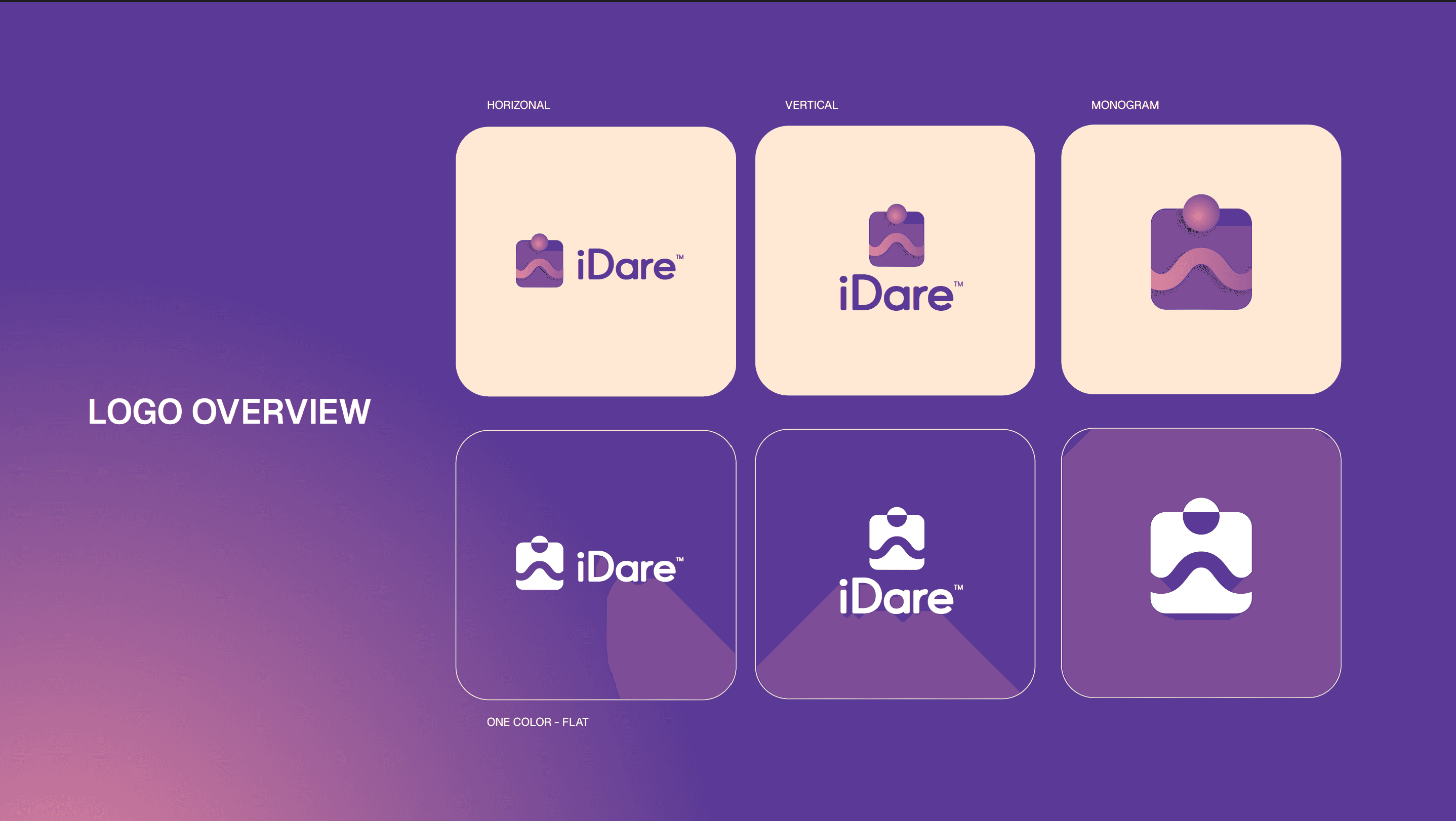
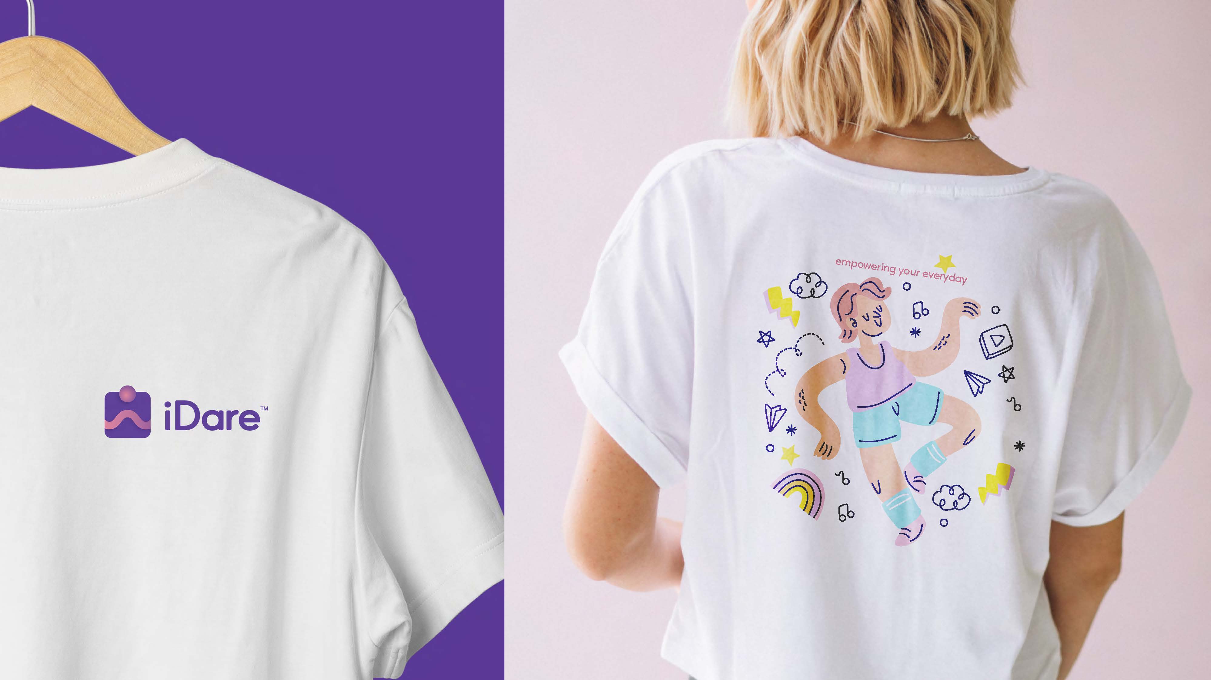
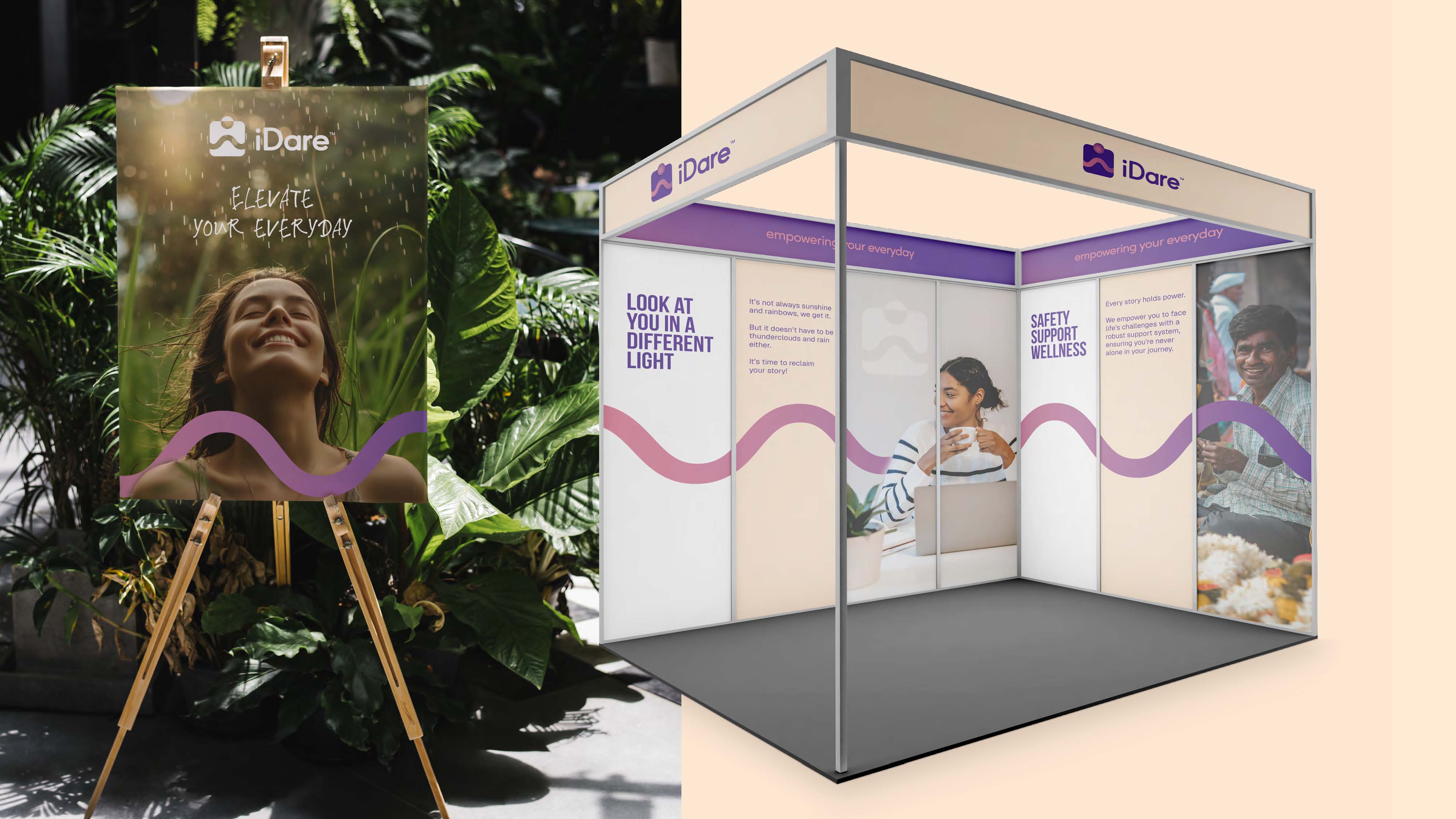
03 — The logo
The mark is built from three simple shapes that represent the three things the brand stands for: people, a safe space, and a journey. Together they read as a figure — a person moving through something, contained within a structure that holds them.
The wave underneath the wordmark is the brand's recurring motif. It carries through the entire identity — backgrounds, section dividers, illustration style — and does something important: it implies movement without urgency. Things are in motion, but not rushing. That's a hard balance to strike visually and I'm happy with how it came together.
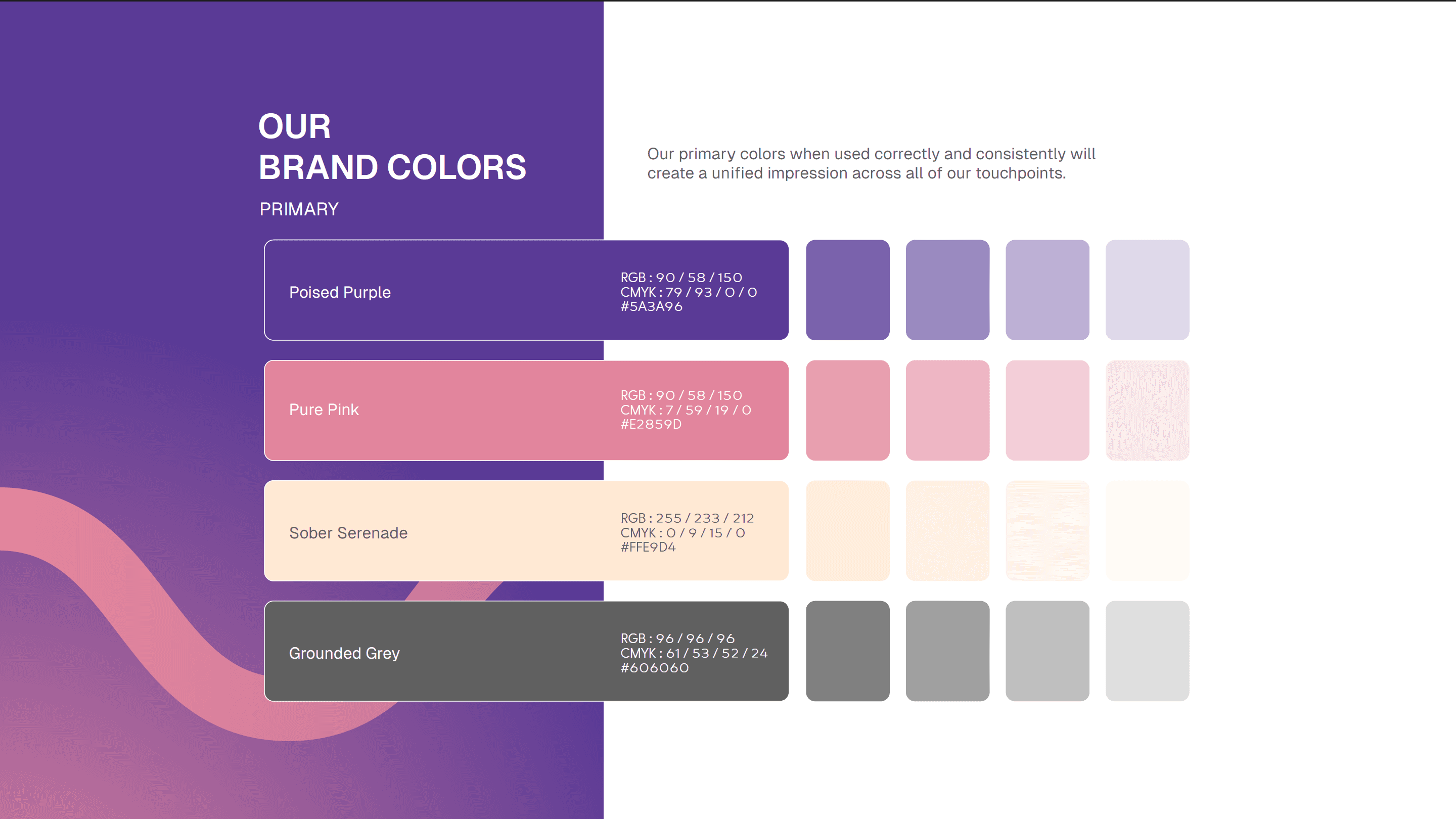
04 — Colour and type
The palette runs from a deep violet through to a soft dusty pink — purple representing the broad, dynamic nature of the journey, pink representing warmth and the brand's commitment to its community. The gradient between them shows up across the identity rather than either colour sitting alone, which keeps it from feeling too corporate or too soft.
The typography uses a clean geometric sans — readable, modern, not trying too hard. The brand needed to feel considered without feeling designed-by-committee, and type choices are usually where that goes wrong. Keeping it simple here was the right call.
05 — The brand values, made visual
iDare's five core values are empathy, resilience, inclusivity, collaboration, and trust. These aren't just words in the guidelines — each one is visualised through photography direction that the brand can use consistently. Empathy through close, human contact. Resilience through age and experience. Inclusivity through diversity without making it feel performative. Collaboration through shared effort. Trust through vulnerability and openness.
The photography direction matters because a mental health brand lives or dies on how authentic its imagery feels. Stock photos of people laughing at laptops wouldn't cut it.
06 — Looking back
Branding projects are different from product design in one specific way — you're not solving a user problem, you're building a language. And with mental health, that language has to do heavy lifting. A wrong colour choice, a typeface that feels cold, a logo that's too sharp — any of these can make someone feel like this isn't a space for them, before they've read a single word.
I'm glad this project gave me the chance to think that carefully about a brief. It's the kind of work where the decisions that matter most are the ones that are hardest to explain — and getting them right is more about instinct and sensitivity than any design framework.