Mesha Energy - IoT Dashboard
Designing an IoT dashboard for people who didn't sign up to learn software.
Product Design

Project Overview
Client: Mesha Energy
Timeline: 6-7 weeks (2024)
My Role: Product Designer
01 — Where it started
Electric auto rickshaws run on battery banks — usually four batteries wired together. When something goes wrong, a mechanic has to physically check each one. No remote visibility, no history, no way to catch a problem before it becomes a breakdown.
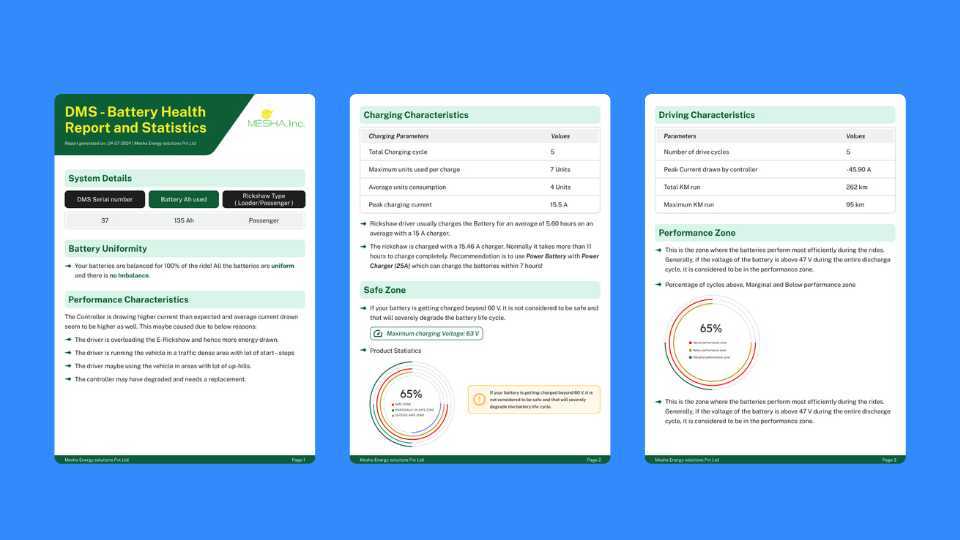
Mesha Energy built a hardware device that plugs directly into the battery bank and streams live data — voltage per cell, bank voltage, current, temperature, speed, location — to the cloud. My job was to design the software that sits on top of that: a mobile app for mechanics in the field, and a web dashboard for the admins and battery companies monitoring everything from a desk.
02 — Two very different users
This is the part of the project that shaped almost every decision.
The mechanic is working on the ground. He might be under a vehicle, checking a battery between jobs, or responding to a breakdown. He's probably not someone who spends a lot of time on smartphones, and he definitely doesn't have patience for an interface that makes him think. He needs to open the app, find the device, see what's wrong, and act on it — fast.
The admin or battery company analyst — someone at Livguard, for example — is sitting at a desk, managing hundreds of devices across multiple customers. They need overview first, the ability to drill into any device when something flags, and reports they can download and share.
Same product, completely different contexts. That tension was the core design problem.
03 — The approach
I went back to my 12th grade physics textbook. Not a joke — I needed to actually understand what bank voltage, state of charge, and individual cell voltages meant before I could figure out which numbers a mechanic needed to see first and which ones could sit further down the screen.
The answer I landed on: lead with the big picture, let the detail live underneath. A mechanic doesn't need to see all four individual voltages the moment he opens a device. He needs to know if the battery is healthy or not. That's the 92% charge level and bank voltage at the top. Everything else — V1, V2, V3, V4, current, temperature, speed — lives in the details section below, there when you need it, out of the way when you don't.
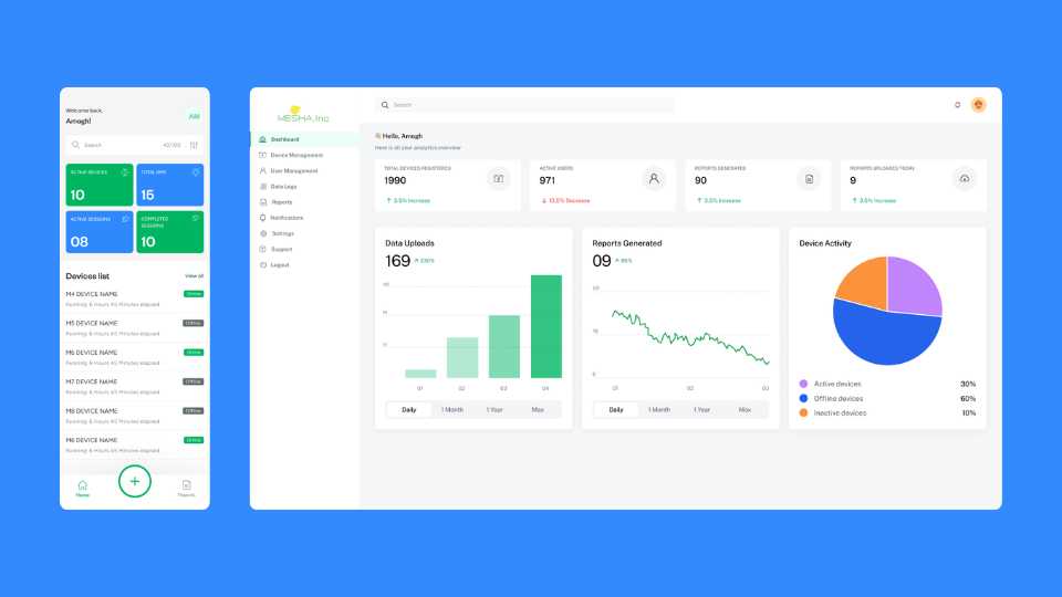
The same logic carried through to the home screen — four stat cards up top (active devices, total DMS, active sessions, completed sessions), then the devices list below. Scan the numbers, find the problem, tap in.
04 — The screens
Mobile home screen Four stat cards in green and blue at the top — the numbers a mechanic or supervisor needs to see the moment they open the app. Below it, the devices list with online/offline status visible at a glance. No clutter, no unnecessary navigation.
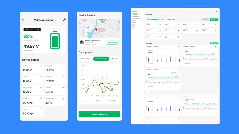
Device detail screen This is the screen I'm most proud of — the whole mobile app, honestly. Charge level and bank voltage lead. Below that, individual cell voltages in a clean grid, then location on a map, then data graphs for bank voltage, individual voltages, and current over time. A download report button at the bottom for when a mechanic needs to hand something to a customer. Everything a mechanic could need, in the order they'd actually need it.
Vehicle registration Registering a new device means entering driver info and battery serial numbers. The expandable B1/B2/B3/B4 sections keep the form from feeling overwhelming — you only open what's relevant to the battery bank you're working with.
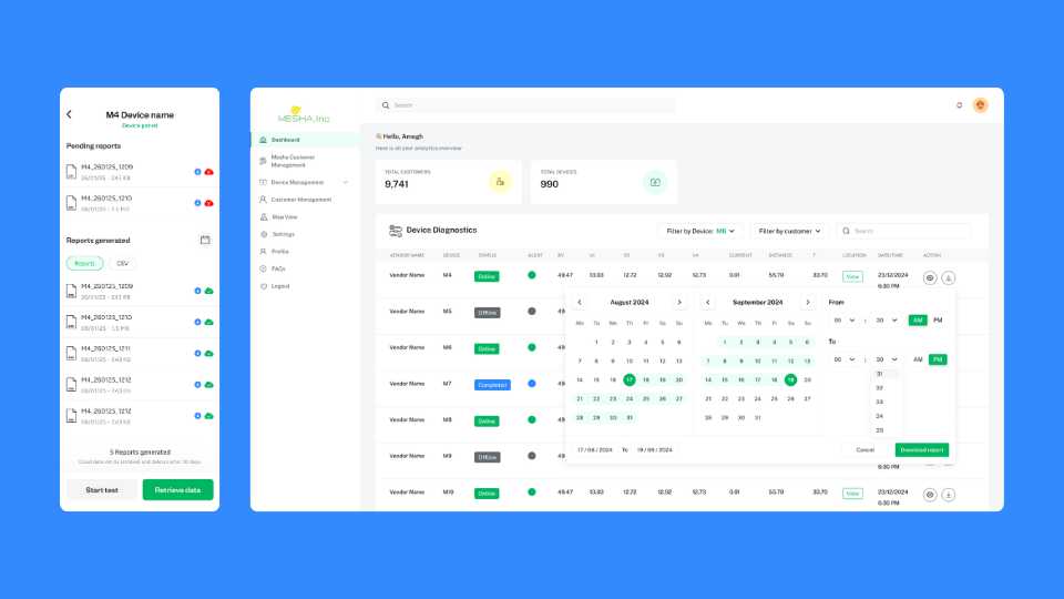
Reports screen Pending reports and generated reports in one place. Download or delete, with file size and date visible. Simple list, no confusion about what's been processed and what hasn't.
Web dashboard — overview The admin view is a different scale entirely. 1,990 devices registered, 971 active users, reports generated, uploads today — all at the top. Below it, data upload trends, reports generated over time, and a device activity pie chart. It's a lot of information, but broken into cards and charts it stays readable.
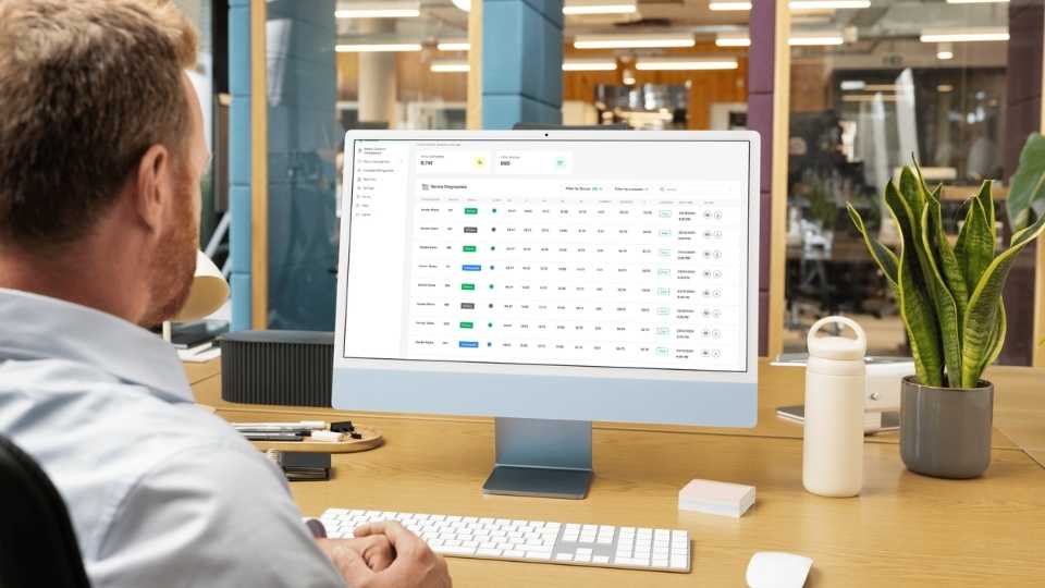
Web dashboard — device diagnostics This is where an admin can see every device across every customer in a single table — status, all voltage readings, current, distance, temperature, location, timestamp. Filter by device or customer, select a date range, download a report. The kind of view that Livguard's operations team would live in.
User management Standard admin table — user ID, name, email, role, status toggle, date added. Clean and functional, nothing fancy needed here.
05 — How it ended
I delivered the designs, the client was happy with them, and they handed things over to their in-house team from there. It's a clean handoff — the design system and screens were solid enough that another team could pick it up without needing me to walk them through it.
06 — Looking back
The interesting constraint on this project was that I couldn't make assumptions about the user. A educated individual familiar with modern tech knows how to use a smartphone. A field mechanic might not — or at least, might not be comfortable with anything that feels unfamiliar. That pushed me toward simplicity in a way that most app projects don't.
If I could go back and change one thing, I'd have pushed to do even one round of testing with an actual mechanic before finalising the mobile app. I made a lot of judgement calls about what to show first and what to bury — and those calls felt right, but there's no substitute for watching a real user try to find something and seeing where they get stuck.