XplorianAI
How do you turn an AI-generated itinerary into something a traveller actually wants to use?
Product Design

Project Overview
Client: Xplorion AI
Timeline: 10 weeks (2024)
My Role: UI Design, Branding, Logo, Landing Page, Mobile App · 0 to 1
01 — Where it started
Around 2024, something interesting started happening. People were opening ChatGPT and typing things like "plan me a 5-day trip to Goa under ₹20,000." And it worked — kind of. You'd get a decent itinerary, but it was just text. No map, no clear direction, nothing to share with friends, and open 10 tabs to search for everything mentioned in itinerary by the AI.
The client spotted this and thought — there's a real product here. Not another AI, but a proper app built around what the AI produces. Something visual, organised, and actually built for how people travel.
He came to me to design it from the ground up.
02 — Who's this for?
Not the obsessive trip planner with colour-coded spreadsheets. This app is for everyone else — the person who knows they want to go somewhere but doesn't want to spend three evenings researching it.
Two types of people kept coming up as I worked through the flows:
The solo traveller — quick decisions, budget-conscious, wants something that matches their vibe without a lot of back and forth.
The group traveller — trying to coordinate with friends or family, needs a way to share the plan without it turning into a 50-message WhatsApp thread.
Both of them shaped almost every screen in the app.
03 — The actual design problem
Here's the thing about AI-generated content — it's great until you have to present it. A ChatGPT itinerary is one long response. Useful, but hard to navigate, impossible to share cleanly, and not exactly something you want to reference while you're standing at a train station.
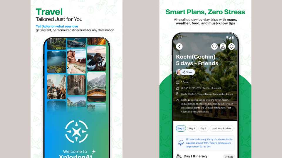
The challenge was figuring out how to take that raw output and give it structure — hierarchy, scannable sections, a layout that holds together whether your trip is one day or ten. The onboarding flow had to do real work too, collecting enough from the user (destination, travel style, companions, budget) so the AI output actually felt personalised and not like a generic template.
04 — Screens worth talking about
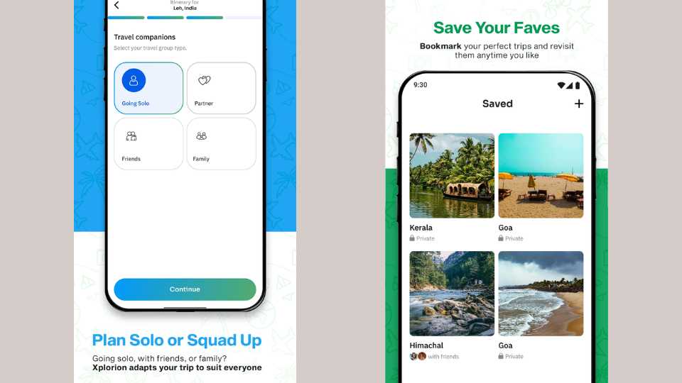
The onboarding — travel companions Before anything gets generated, the app asks who you're travelling with. Solo, partner, friends, family — a simple 2×2 grid, one tap. It's a small screen but it matters a lot, because the answer changes everything about the itinerary the AI builds.
The itinerary view This is the main screen and the one I spent the most time on. The destination hero image at the top sets the mood immediately. Below it — duration, weather, locations covered — and then a day-by-day tab structure so the itinerary is broken into actual readable chunks. There's a Redo button too, so if the first result doesn't land, you can regenerate without starting over.
The screen I'm most proud of Most travel apps give you the itinerary and leave the rest to you. I pushed to add a screen that covers the stuff people always forget to look up — weather conditions, what to pack, safety tips, local essentials. It's the kind of thing a friend who's been there would tell you. Having it right inside the app, next to the itinerary, means users aren't jumping between five different tabs to piece together their trip.
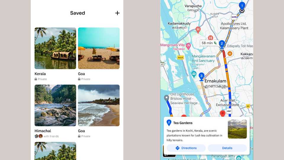
Saved trips Bookmark any itinerary, come back to it later. Private or shared — the grid layout makes it easy to browse without it feeling cluttered.
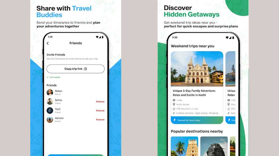
Share with friends Copy a link, send it to the group. Friends can view or co-edit, and the owner controls who has access. For group trips this is genuinely useful — everyone's looking at the same plan.
Discover — weekend getaways For when you don't have a destination yet. This tab surfaces nearby weekend trip ideas with distance, activities, and a small social nudge (viewed 14 times today) that makes it feel alive rather than static.
05 — Branding
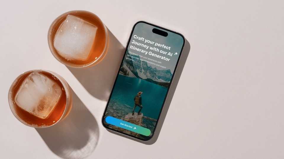
The blue-to-green gradient came from a pretty simple instinct — it should feel like going somewhere. Sky at the top, landscape at the bottom, the sense of a horizon you're moving toward. The logo is a compass with a sparkle worked into it, a small nod to the AI layer underneath without being literal about it.
The component system — cards, tabs, chips — was built to repeat consistently across every screen so the app feels like one thing, not a collection of separate pages.
06 — How it landed
The app shipped to the Play Store on time. Everything in scope got delivered — UI, branding, logo, landing page — within the three months.
It hasn't taken off yet, but I don't think that's a design problem. The experience works. The issue is that the app hasn't been marketed at all, so it simply hasn't found its users. That's a real constraint outside of design — but it's worth being honest about.
If I could go back and change one thing: I'd have found a way to test the itinerary navigation with a few real users before handoff. The day-by-day tab structure made sense to me, but I'd want to know if someone using it for the first time figures it out without being told. That's the one open question I'd want to close.