Scale-Up Health 2025
Designing the full event experience — app, web, print, and motion — in two months.
Design

Project Overview
Client: Scale-Up Health 2025
Timeline: 2 week (2025)
My Role: Lead Designer
01 — Where it started
Scale-Up Health is a closed-door event — CEOs, founders, managing directors, senior healthcare executives. The kind of room where people come to have real conversations, not collect lanyards. Eight Roads and McKinsey & Company needed a digital companion for attendees: somewhere to check the agenda, find speakers, connect with other people in the room, and exchange contact details without fumbling for a business card.
They also needed everything else — the event page, social media posts, banners, a curtain raiser video, presentation graphics. All of it, in about two months.
02 — The attendees
Senior healthcare and investment professionals at a one-day summit. These aren't users who need to be onboarded — they know how to use an app. What they don't have is patience for something that slows them down. Between sessions, over cocktails, on the way into a panel — the app had to work in whatever sliver of attention an attendee could spare it.
One other thing worth noting: the room was full of potential connections. The networking angle wasn't secondary — it was central. The ability to find someone, send a message, and swap contact details needed to feel as natural as possible.
03 — The approach
With a week to design and a week to build, there wasn't room for exploration. I had to make clear decisions quickly and move.
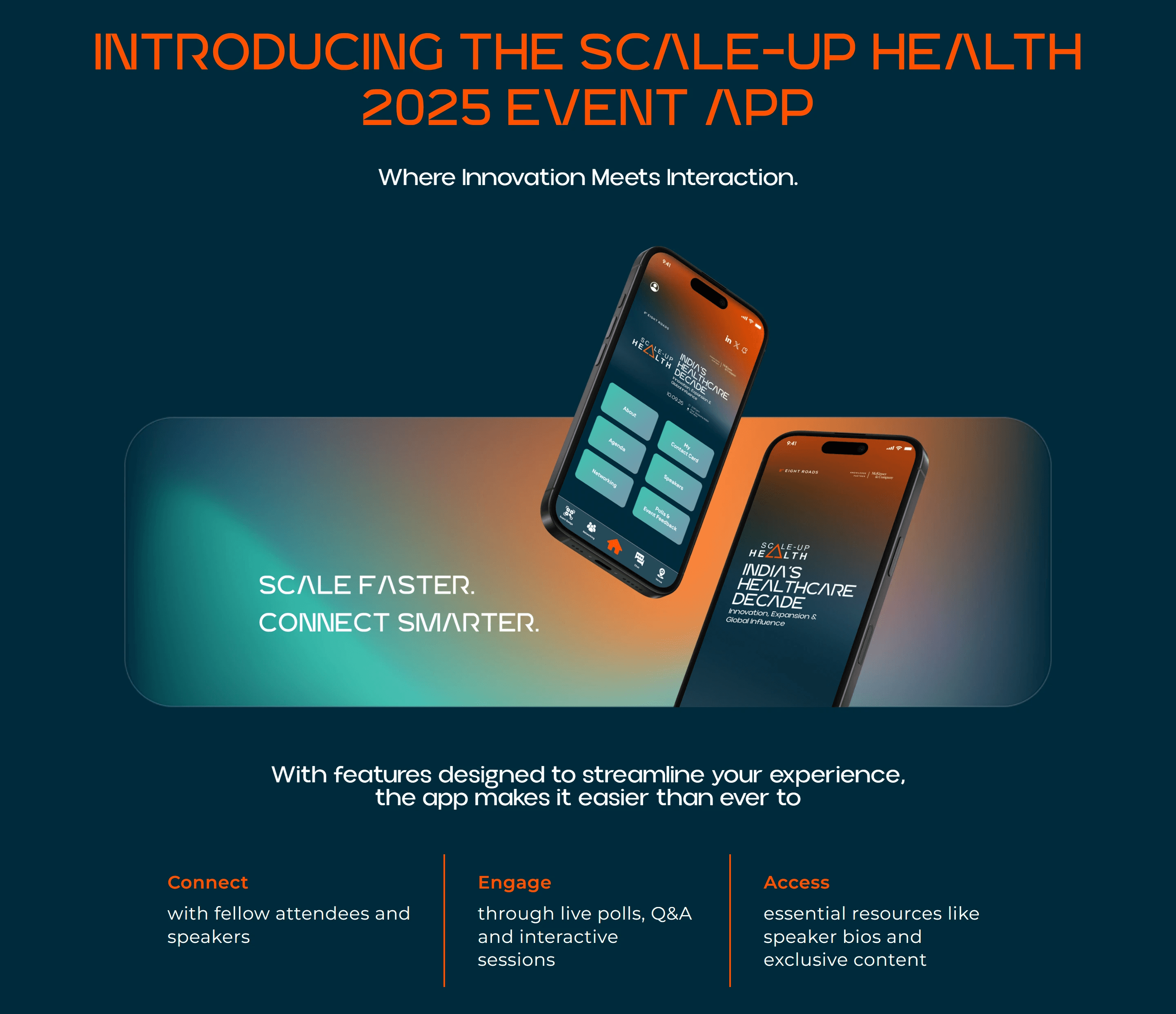
The visual identity came together fast — deep navy-to-rust gradient, orange as the accent, a geometric typeface that felt premium without trying too hard. The logo mark for Scale-Up Health uses the triangle as a recurring motif — it shows up in the agenda dividers, the navigation, the brand prints. Small thing, but it gives the whole suite a consistency that makes it feel designed rather than assembled.
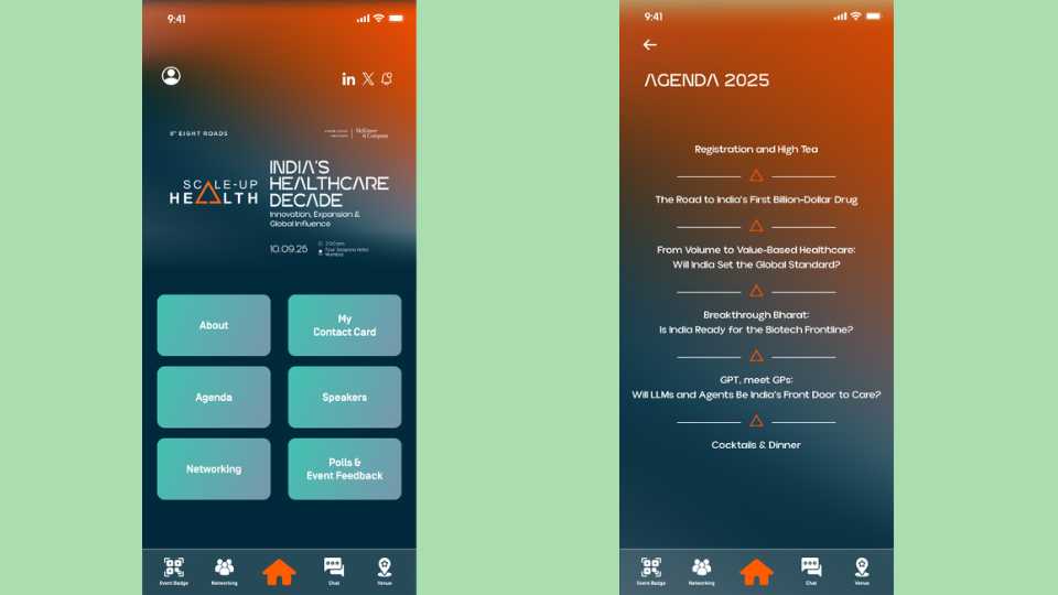
The app structure was deliberately simple: six tiles on the home screen covering everything an attendee would need — About, Agenda, Speakers, My Contact Card, Networking, Polls & Event Feedback. Bottom nav with Event Badge, Networking, Chat, and Venue. You can find anything in two taps.
04 — The screens
Splash screen The event identity front and centre — Scale-Up Health, India's Healthcare Decade, Eight Roads and McKinsey logos. Sets the tone before you even get inside.
Home screen Six tiles, clean grid. Date, time, and venue visible right below the event title so no one has to go looking for the basics. The teal tile colour against the dark background gives it energy without being loud.
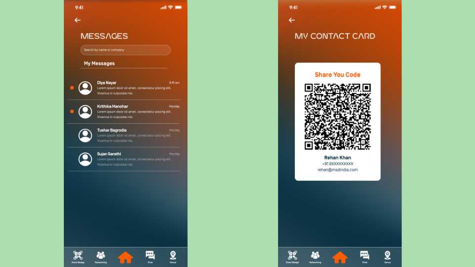
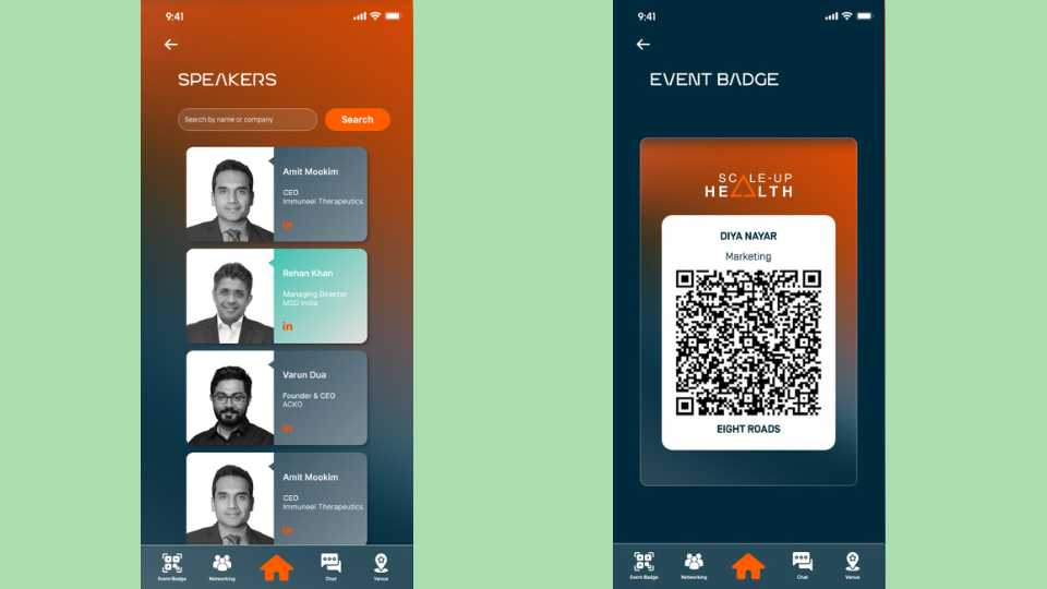
Speakers List view with photo, name, title, and company. LinkedIn icon on each card so attendees can connect on the spot. Search by name or company at the top for when you're trying to find someone specific quickly.
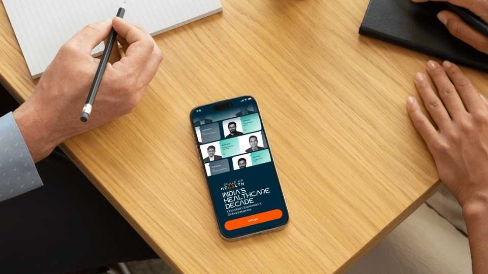
My Contact Card QR code front and centre. Name, number, email below it. Scan and done — no typing, no fumbling. For a networking-heavy event this screen probably got as much use as anything else in the app.
Messages Standard inbox — name, company, message preview, timestamp. Unread indicator in orange. Clean enough that it doesn't feel like a separate product dropped into the app.
Agenda The triangle motif from the brand does the work here — each session separated by a small orange triangle, the event flow readable in one scroll. Registration and High Tea at the top, Cocktails & Dinner at the bottom, the panel topics in between. No times listed, which keeps it from feeling like a schedule and more like a programme.
05 — Beyond the app
The web app was one deliverable of several. I also designed the event page for their existing website, social media posts for the lead-up to the event, print assets including banners and other event collateral, a curtain raiser graphic for the event opening, and motion graphics for their presentation decks.
Everything used the same visual language — same gradient, same typeface, same triangle motif — so whether an attendee saw a social post a week before, walked past a banner at the venue, or opened the app during a session, it all felt like one event.
06 — Looking back
A week to design something for an Eight Roads and McKinsey event is not a lot of time. But honestly, the constraint helped — there was no room to overthink it. The brief was clear, the visual direction clicked early, and the scope was well-defined enough that I could move fast without second-guessing.
The one thing I'd have liked more time for was the networking flow. Helping attendees discover who else was in the room — not just message people they already knew — could have been more thoughtful. A quick filter by industry or role, maybe a suggested connections feature. It wasn't in scope, but for an event where the whole point is who you meet, it would have added real value.