Step by GHA
Designing an EdTech app for NEET PG and FMGE students, built by the doctors who know the exam best
Product Design

Project Overview
Client: Step by GHA
Timeline: 8 weeks (2025)
My Role: Lead Product and Visual Designer
01 — Where it started
NEET PG and FMGE are genuinely hard exams. The syllabus is the entire MBBS curriculum, the students are already exhausted doctors, and most of the prep material floating around online is either incomplete, unstructured, or just not very good.
The clients were specialist doctors who'd watched their students struggle with this for long enough. Their take was simple — they knew exactly what needed to be studied, in what order, and what the exam actually tested. What was missing was a proper place to put that knowledge so students could access it without having to hunt around the internet for it.
They came to me to design that place.
02 — Who's studying here
NEET PG and FMGE students are a specific kind of user. They're medical graduates, usually in their mid-to-late twenties, who already know the subject matter from MBBS. What they're doing is revision under serious time pressure, often while managing other things in their lives.
That context shaped a lot of decisions. These aren't users who need the app explained to them. They need to open it, find what they're working on today, get through it, and move on. The design had to get out of their way.
03 — The structure that holds everything together
The clients came in with a clear concept — break the entire syllabus into Steps. Every topic follows a three-phase flow: a PYQ pre-test to see where you stand before you start, a focused video lecture, then a post-topic test to check what actually stuck.
My job was making that logic feel natural inside the app rather than clinical. The tab structure inside each subject — Step 1, Step 2, Step 3, Notes, Subject Test — ended up being the spine of the whole experience. You always know where you are in a topic, and what's next. No confusion about where to go.
04 — Screens worth talking about
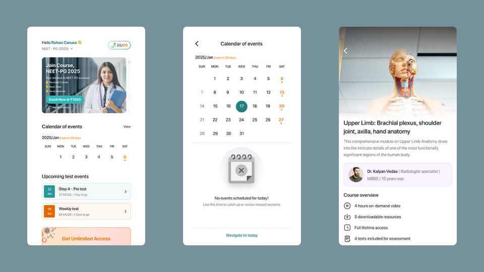
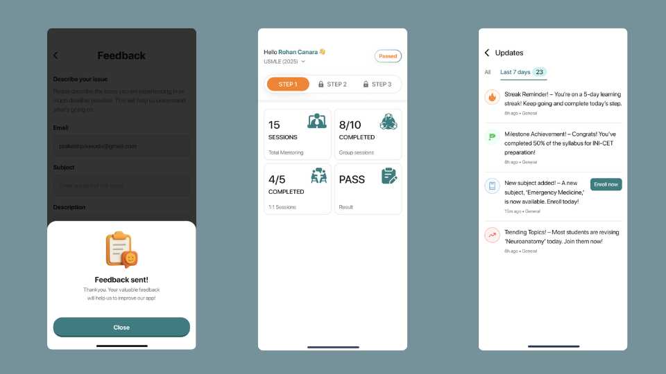
The course view Each subject opens into the three-step tab structure. Video lectures sit alongside PYQ tests and completion tests, with duration and MCQ count visible upfront so a student can decide whether they have time for it right now. Expanding a topic shows a short description and a play button — in, out, no extra taps.
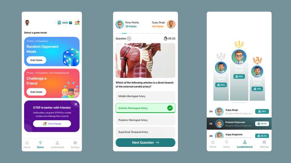
The MCQ test screen Timed, with the scoring system (+4.0 / -1.0) visible before you answer. There's a question counter, a pause button, and a flag to mark questions for review. Students spend a lot of time on this screen, so it needed to be readable and calm — not cluttered with things trying to look clever.
Notes Organized by subject, expandable by topic. Clean list, no visual noise. The positioning of these notes was that they're curated enough to be the only ones you need — and that kind of credibility comes from the design feeling considered, not decorated.
Progress and streak screen — the one I'm most proud of This was the client's big ask from the start, and it turned out to be the most interesting problem to solve. The calendar shows your study streak — completed days highlighted, today marked, missed days visible without making you feel terrible about them. Below it, four stat cards: total watch time, steps completed, tests attempted, questions attempted. It's a decent amount of information on one screen, but broken into cards it breathes properly. The goal was for a student to open this and immediately get a clear sense of where they're at — and I think it does that.
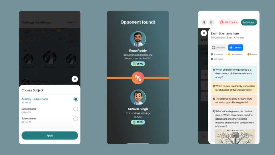
Leaderboard Top three get the podium layout with marks and time shown. Below that, a clean ranked list. This audience is used to being ranked — entrance exams have been part of their life for years — so this screen carries more weight than it might in other apps.
05 — How it landed
The app launched with a proper launch event — not every client does that, and it showed how seriously the team took the product. It's live on Play Store and App Store, has good download numbers, and solid ratings.
It's not competing with the top NEET prep platforms yet, but the product is strong and the students using it seem to agree. Growth from here is a distribution question more than a product one.
06 — Looking back
Working with clients who have deep domain knowledge is genuinely a good position to design in — the brief is clear, the content is solid, and you're not guessing at what users need. The challenge is translating very specific educational logic into something that feels light and simple on screen.
If I could go back and change one thing, it'd be the first-time experience. Understanding the Steps system — why it's structured the way it is, where to begin — is probably the moment that determines whether a new student commits to the app or bounces. We didn't have the time to give that the attention it deserved, and it's the first thing I'd revisit.